SEE Logo Update

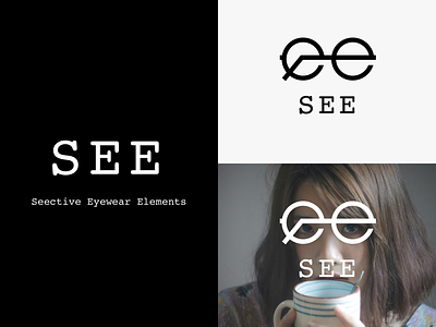

I have gotten my glasses at SEE for years now. Their logo is a simple one. Nothing particularly wrong with it. I just thought maybe it'd be nice to add a graphic to go along with it.
It deliberately heroes the letter 'e'
I have gotten my glasses at SEE for years now. Their logo is a simple one. Nothing particularly wrong with it. I just thought maybe it'd be nice to add a graphic to go along with it.
It deliberately heroes the letter 'e'