WildeMedia Rebrand Paw

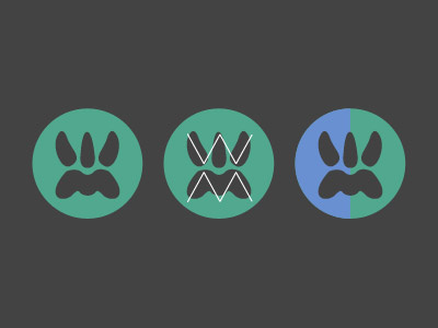
I've adjusted the paw to look more like a 'W' and an 'M' for WildeMedia. I want to keep the logo clean with no crazy rough edges making it look even more wild. Think the paw is enough to be honest.
Logo 1: Pure paw logo.
Logo 2: Shows the W and the M shapes.
Logo 3: Change brand to green for more 'wildness' or stick with my blue?
Let me know of any criticisms, ideas, colours, etc.