Cycling Team Branding: Saltwater Saints logo sheet

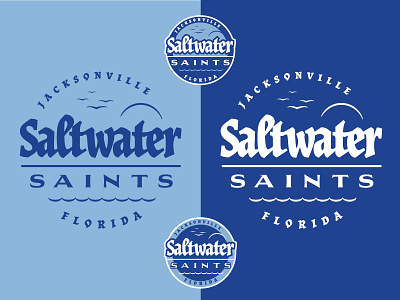
The logo is flexible enough to be presented as a one color, inverse, in a lockup like 3-color badge-logo. Brand elements, the 4 birds flying represent the 4 riders on the cycling team, the flat road, the sunny sky and wavy waters of the east coast, and some pirate-esque type choices. Hope you dig it!