


Duchenne and Me Version 3 – Dark Theme

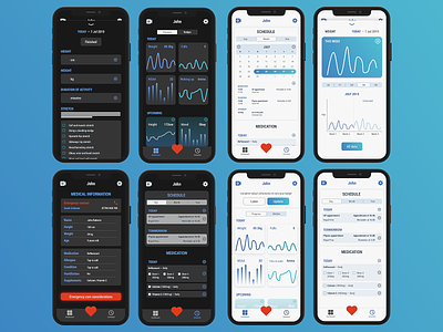
Working through a dark theme for Duchenne and Me to make it easier on the eyes in a dark environment. Using a dark grey instead of pure black to avoid OLED smearing. I've also ensured it's not a pure inversion so the it works better when trying to understand content hierarchy.