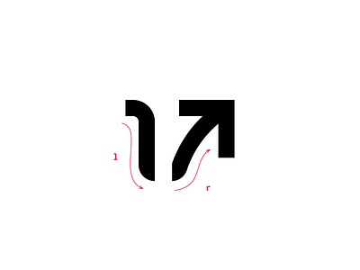
Last Rep. - Arrow Detail
Brand identity and wallpaper designs for Last Rep. (https://www.lastrep.ca/), a new fitness studio in Toronto.
Last Rep. believes that everyone with a fitness goal should be treated like an athlete. The fitness studio features unique HIIT (high-intensity interval training) experiences, which are inspired by team sports. Working with a team goal in each class, people can stay motivated by competing alongside their teammates and coaches, especially for the last repetition.
They needed a visual identity which is welcoming and inclusive but also strong and sophisticated at the same time. My response was a bold but also sleek arrow representing the rising motivation. Taking shapes from the initial letters of the brand name, the first half (the letter l) represents the decline in energy and motivation before the last rep, while the latter part (the letter r) expresses the rise of energy for the final effort.

