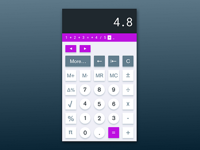
#DailyUI 004, Calculator

#DailyUI 004
“Design a calculator…”
I opened my email this morning to see the calculator challenge, and the Kool-Aid man’s voice shot through my skull screaming, “Oh, yeah!”
I know I’m not the first designer to turn to Dieter Rams for inspiration in designing a calculator, but that’s because the “Less, but better” mentality is perfect for such a task. With that in mind, I did a bit of research regarding the user experience of a calculator and found a wonderful article from UX Movement detailing what buttons could be altered in order to vastly improve the user experience. This is what I applied to this UI challenge, and I’m quite happy with the outcome here. I’d love to learn what you think!
Here’s the article with the results of the user research I based my design on.
https://uxmovement.com/thinking/why-calculators-need-a-better-user-interface/