minusminimal — creative studio // about page

Hi Dribbblers,
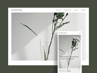
I'm a big fan of large covers, especially with white paddings. It's not missing so much to enter the fullwidth view. A framed cover looks more ordered, more clean - seems, it's all structured.
This is the ABOUT page of a website relaunch of my current project.
What do you think about? I appreciate your comments and thoughts you have in mind.
If you like, feel free to hit the lovely "L".
ThanQ & Cheers