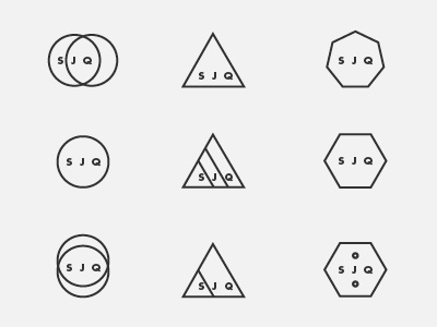
STUDIOJQ - Brand refresh - logomark ideas 2

STUDIOJQ - Brand refresh - logomark ideas 2
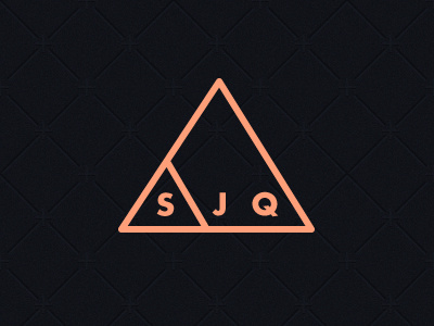
I quite like the development of this mark, as says 'STUDIO' & 'JQ' and it's contained, neat and precise.
I also wanted to use the font weight to be the same as the stroke on the triangle.
Colour wise, am thinking salmon, or astral blue.
Thoughts?