


Final Identity

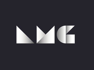
The concept behind my identity was to create a mark that used only the three basic foundational shapes of design: triangle, square, and circle. My interest and appreciation of minimalism, modernism and suprematism are which drive the design choices that follow. These movements in design focus on structure, grid, shapes and simplicity. Modernism’s place within my identity came from reading The ABC’s of Bauhaus, The Bauhaus and Design Theory; I was inspired by the understanding of these shapes and their purpose within design. Bauhaus originally personified each shape with their own characteristics, and allocated a color to each. These colors directly represent the personality of the shape: the yellow triangle, red square, and the blue circle. My love for suprematism brings simplicity of color into my identity. Black, white and values of gray represent who I am. Black is bold and strong, while the white is stunning and impactful. In order to add some form of color within my identity I referenced the original Bauhaus shapes and colors. I brought them into Photoshop and gray scaled them to attain my color palette, a soft gradient of grays within each letter. Minimalism’s purpose within my identity is simplicity. The mark sits within black negative space to allow
each letterform to glow and gain dominance. After the creation of my mark, I gave meaning to each shape, and in turn, meaning to who I am as a designer. Each shape not only represents who I am but also a
step within my design process.
The Triangle: Sharp, rational, attentive, and listens.
The Square: Strong, bold, loud, direct, and concepts.
The Circle: Passionate, sensitive, cares, and answers.