


Daily UI challenge #005 App icon

App icon and Logo are not the same thing. So, I have followed thses tips in my design to design a good app icon:
1. Scalability
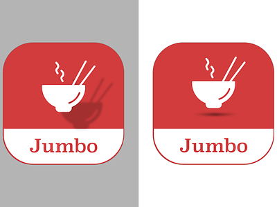
- Make sure the app looks good on different color's backgrounds
- Working on 1024 pixel canves because the icon is going to be shown in different platforms and different device's sizes.
- if you try to make complicated icon and cram multiple objects in icon that often leads to bad scalability.
- Simplicity through focing on a single object.
2- Recognizability
The user should be able to identify app icon eaily.
- Remove details from the app icon because complex icon is hard to remember in other hand a too simple icon will surely look similar to other ones, you have find the balance of the design
- Recognizability is often connected with uniqueness.
3- Consistency
- Consistency between app and icon by keeping same color palette of interface and icon.
- Validate if the symbols of the icon and the app are visually similar
4- Uniqueness
- It is good to make the competitive analysis of the solutions similar to yours first
- Make the competitive analysis of the solutions similar to yours
- Use different colors and compositions to make your app icon unique
The last tip is testing app icon with various backgrounds