


Ticketing admin dashboard (1/2)
Based on competitor analysis and user interviews I re-designed the dashboard UI that event organizer use to view reports and manage their visitors.
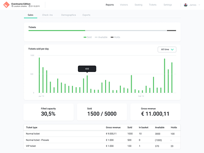
To make things simpler Introduced common patterns and re-used them over all pages in the dashboard. For example: filters aligned on the left, while actions are aligned on the right. Also the most often used actions are primary CTA buttons in blue, while secondary buttons remain white. Every active modifier is highlighted in green, to quickly spot which sorting and filtering is active on the page.
Overall I tried to create a layered UI from simple to begin with to offering deeper settings for advanced users.