Chart Colors

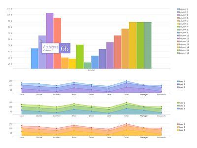
Charts that I designed for a banking platform: the first one uses vertical bars, i.e. columns, and the rest are so-called area charts.
Initially, there were 8 colors, but the product team needed me to support more values for the first one, the column graph.
"Backslash" hatch doubled the number of available visualizations to 16 values: 8 regular colors + 8 hatched colors. This is a wonderful trick they used in old, obsolete devices — books and encyclopedias.
I believe this approach was a much better solution than creating a crazy, disparate range of colors from bright yellow, through screaming green and sick blue to pitch black.
In case you need to support even more values, additional "slash" hatch (tilted to the opposite side) would add 8 more colors, to a total of 24. But you shouldn't put 24 distinctive values into a graph anyway. Additional values should end up in a column named "Other" or something like that.
Empirically, there should be somewhere between 2 and 10 columns (colors), but we must always support more.
For this chart library, I defined 16 possibilities, just in case. Nobody ever asked for more than that.
→ You can read about it here: Design Language — case study
░░░░░░░░░░░░░░
❤︎ button or L to like
Follow me for more
░░░░░░░░░░░░░░
Button: ❤️ or keyboard: L to like...
Follow me for more shots!
░░░░░░░░░░░░░░