


iPhone Sign in / Login Screen (Need Opinions!)

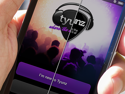


So, I've been working on something over at Collective Ray for the past few weeks. I can't say too much about it yet, but I can say that I've been super stoked on how it's turning out.
The client's been awesome and has handed over the 'Creative Reigns' on this—and we've both been happy with the result so far. That is, until we hit this screen.
So, Dribbble, I ask you—which of these two screens is more visually engaging? Feel more polished, professional? Which sets your expectations that you're about to have a good experience?
My thoughts around this—being that it's the first screen the user'll be presented with—are basically as simple as "a good first impression can make or break something," and I think that's especially true in the world of Mobile Products.
Now, that being said—which is more legit? What do you prefer?
UPDATE: WHOA, THANKS FOR ALL THE SUPER-QUICK FEEDBACK! MORE SO THAN THE COLOR OF THE BACKGROUND IMAGE, THOUGH, WHICH LOGO TREATMENT DO YOU FIND TO BE A BETTER CHOICE FOR THE CONTEXT?