iOS Mail Redesign

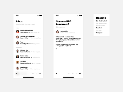
I decided to redesign the iOS Mail App. You may ask why? I wanted to make interacting easier. That's why I put every button on the bottom bar to make it easily reachable especially when using a big device. To keep structure I decided to put the back chevron on the left and any other buttons on the right. The button with the most important function is darker than the others for the sake of visual guidance.
What do you think? Does my redesign ensure better usability or what could have made it better?