Teleport - Logo Design ✨


Logo design for Teleport ✨
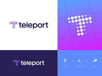
Teleport is a HaaS based solution. A platform to speak with your distant teammate, instantly in 1-tap at any time through a dedicated device.
Refined version on this concept after we felt the mark was too complex to use for specific product usage. I decided to make the foot of the T a little shorter so it’s has nicer proportions.
Overall this feels really interesting and expresses the exact look and feel which I had in mind for the the product/service. Curious to hear your thoughts on this and if you may or not seen anything similar before. 💭
Check the attachment for the subtle typography adjustments.
Currently open for feedback.
_ _ _
Are you looking for a logo (re)design for your business?
I'd be happy to hear your story! Feel free to reach out!