


Curry Paradise

Check the full project on link below:
https://www.behance.net/gallery/80323517/Curry-Paradise
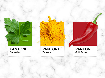
Indian food plays a central role in the identity for this Brixton’s independent brasserie, as 3 key ingredients in the local cuisine are turned into powerful visuals by magnifying them and experimenting with contrasting backgrounds.
A straightforward logotype, evoking classic architecture and traditional lettering, emphasises Indian conservative values to keep the brand relevant to its customer, while targeting a younger audience with its hip design.
Gill Sans, a modern font paying homage to English designer Eric Gill, has been introduced to represent the strong bond between the British and Indian cultures over the past decades.