Logo design

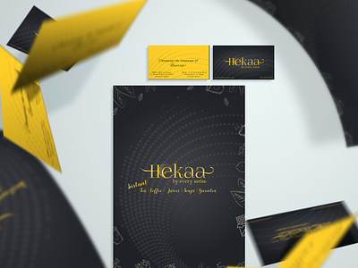
Hekaa -an Egyptian word that translates to self-sustain was the name chosen by the beverage brand that had a very innovative idea.
The typo and the color scheme chosen to reflect their brand was minimal yet catchy with vector icons to represent their brand's versatile.