Gmail - Redesign

I've been using Gmail for ages now. In my opinion, it's the best email provider hands down, the moment I switched from Yahoo and Hotmail.
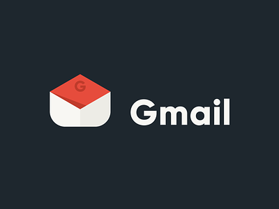
I have a knick on the Gmail logo for quite some time now. Thing is, personally I think the icon itself is quite lacking on its consistency. Some of Google's product icons have different looks compared to the other.
Take a look on your Gmail app icon. Does it look appealing to you? Does its appearance consistent with their other product icons (chrome, keeps, etc). I can say it looks good on its own. But with square or circle background? Kinda hanging or messed up to be honest.
I'm using android 🤖, so I can simply change the way it looks using different app icon or launcher. But, it could be easier to clean up the mess if Google redesign their existing app icon to have that better overall looks.
You may disagree, but it's my 2cent nonetheless. It's either good or better. I'll post the mockups as usual tomorrow. Stay tuned!