Matéreal Designs logo

Matéreal Designs in my freelance business.
.
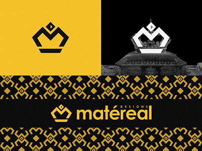
A simple Crown and letter M merged to form a Bold, Simple, Professional mark.
.
The reason why I chose the royal crown is to portray the quality I provide in each project. The jewel on the top shows a forward arrow, a small touch to show that Matéreal is always improving and moving ahead.
.
I wanted to rebrand my existing brand identity because,
- The old logo was not functional at smaller sizes, both symbol and logotype.
- It was hard to understand what the old logo actually stood for.
- It was very hard to make a brand system along with the old logo
- The old logo simply didn't portray Matéreal as I invisioned it.
.
.
Would love to know your thoughts!
.
You can check out my other works on
Instagram