


Fawzlabs Logo design

Every brand has a story, similarly its logo has one. So does the designer who created the logo.
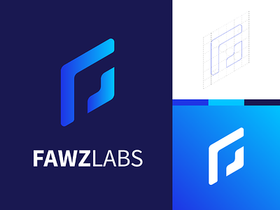
Getting into the visual design, this is a negative space iconic mark type logo combined with the brand name wordmark. The base shape is a square, viewed form an isometric angle. Shapes are removed from the base skewed square to bring out the alphabet F. Some of the corners are made round while keeping some sharp, this making the negative space in the shape consistent.
The way I arrived at this was quite unprecedented. The initial idea was to create an icon for F. Simple, elegant and geometric, those were the requirements. Initial sketches revolved around stacking cubes to form the alphabet F. The end result were either not interesting or similar to some existing logo designs. Further down the road, the logo concept escalated to F and L inscribed on three faces of an isometric cube. At first they seemed possible but when it came to actual design and shading, it was hard to identify as a proper F and an L. Keeping this aside, I started working on an another logo with the same 3 faced cube. On successfull completion of that logo, one of the three faces was offseted to reveal a shape similar to the final logo. The one and a variation of it made by rotating a shape resulted in the current logo.
Color for the logo was determined during the design thought process. Blue is supposed to portray freedom, trust, wisdom and joy. These values are reflected in the company as well as the bramd they are ought to create. The Selection of a blue diagonal gradient for the iconic mark and a darker blue fill for the wordmark seemed perfect for the logo.
One thing I learned during the process is to keep experimenting. If one thing doesn't work out, take a pause, and then pursue it.