Signals - Dashboard Side Bar


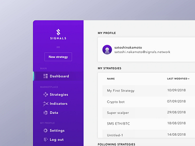
An optimal solution for text inside side navigation vs heavy data tables.
The first time the user opens a new app, having text next to icons is always better. However, as the user gets used to the app, the permanent text might not be necessary and the user may prefer more horizontal space.
👀 Check Signals Case Study on Behance
❤️ Press “L” to show some love!