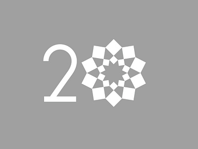
ZY Group 20th Anniversary
Zygroup is a large engineering company, 2019 is their 20th anniversary, I designed the 20th anniversary logo for them.
The logo of the 20th anniversary draws the "square" element of the group logo, and 20 squares form two concentric circles, meaning 20 years of rain and concentricity. The whole shape is like a blooming flower, reflecting good wishes for future development.
In the use of color, the group's standard gray system is adopted, and the square size misalignment combination also has a certain modern sense.
View all tags
Posted on
Apr 14, 2019
More by Xianghailong View profile
Like


