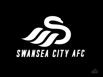
SWANSEA CITY AFC.
I had to give it a go to Swansea City AFC logo. I liked the idea they had but I really didn't like the Swan and the wordmark placement . My input was to make that "S" more prominent and clean and have the feathers a bit more wavy (sea/waves). At the end i added the boldness as I believed that it was necessary. .
.
More elements can be found in the attachment below .Also let me know what you think! 😊👍
.
NOTE* NOTE AN OFFCIAL REBRAND OF THE SWANSEA CITY AFC. *
.
Contact:
ltdesignsss@gmail.com
Follow me.
birds
bold
brand
branding
football
football club
graphic design
identity
logo
mascot
sports
sportsbranding
sportsidentity
swan
swans
swansea
swanseacity
View all tags
Posted on
Apr 11, 2019
More by Lia Tanasa View profile
Like


