Pantone Sandwiches | Typographical Poster

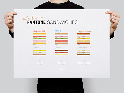
This project that began in late February was based around the idea of designing a typographical poster that would help poke fun at the Pantone Colour Chart guide, by the way of using the chart itself as a signifier for an all-new Pantone-orientated sandwich menu, with the inclusion of a visual style that combines minimalism and simplicity together.
To see the full project, be sure to head over to my Behance blog :)