


Project F logo

This project didn't work out in the end (some just don't) but this was my final concept.
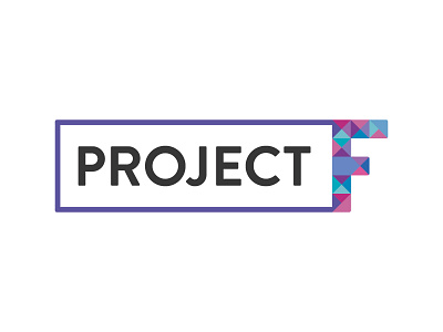
Throughout the branding process, the idea behind the initiative developed and new ideas formed and one of those was a need for a certificate and a logo that looked like a stamp, which was the main driving force behind this design.
I think the F works well as a mark, especially with the hidden blue arrow suggesting growth and I think the mark works well with the friendly typeface as a stamp. The rounded corners used throughout again create a friendly and approachable design and I think the colour palette has been extended enough that it sits well with the Future of Work logo but also stands on its own. The logo would have worked well on t-shirts and hats, which the client asked for.