Strava concept

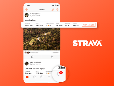
Have you felt annoyed reaching for the far ends of your screen everyday? Notifications are definitely one of my top used buttons and I strongly feel it should be placed at the bottom bar compared to the more icon @Strava has currently.
While looking at activities of my friends in my feed, I don't necessary want to enter an activity to check all details, I probably only want to check for 'elevation' or 'moving time'. If its available on scroll, you don't have to always deep dive to see all details, of course unless you want to, in that case, click on the activity.
I think adding pagination to the pictures save a lot of noise on the screen which currently is shown in a carousel style UI.
The last thing I have changed here, is the tabs on top. Your home is your feed, you see all the activities here. Your new activities will sync and land you right back here, as opposed to 'your' tab. If you still wish to see your activities, go to your tab from the bottom bar (I need to create a design and post)
Do you use @Strava? What is your sport? Comment. Discuss. Like.