Daily UI 14

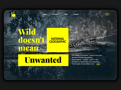
Thumbing through Instagram, Dribbble, Behance, I see it all the time. Great photo, on top of it a wonderful font, colors taken from ready-made color palette. Very beautiful, but so lifeless, dull and pointless. I think the designer should do something more than just take someone else's photo, someone else's font and voila. Therefore, I like Swiss typography - simple, but ideologically interesting. So here my Daily UI turns into a Weekly UI to have time to do something more complex and meaningful. I will try to post out the work details here. See you 😉
Your criticism is welcome 👇