JWA Logo ID

Today’s Logo breakdown covers a lettermark project and colors for the JWA (Janesville Wrestling Alliance).
The Client was looking for a logo solution that was simple (easy to scale large or small) and appropriate to their brand. The solution needed to appeal to the community of wrestlers and fans of wrestling, while being unique enough to be an easy identifier for the JWA brand.
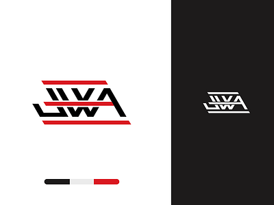
The Solution that I came up with was to create a lettermark using a single line weight to create each letter. After some exploration and experimenting with the lines, I was able to extend the crossbar from the letter A, which created an interesting look.
After further experimenting, I found that by repeating the crossbar line from the middle on the top and bottom, of the letters, I was able to create a visual association to wrestling ropes that tied the letters together nicely.
Giving the mark an italicized feel created a visual association with the old WWE RAW logo mark that was commonly accepted among the wrestling community. Using that as inspiration for this mark, It was a perfect way of showing homage while creating something that is new and exciting.
The result was this simple, and easily identifiable mark that works great in 1 color, full color, and is simple enough to scale and work in multiple applications.
If you are looking to update your existing branding or create new branding from the ground up, OR if you have any questions at all, feel free to send me a message and I will answer your questions as best as I can.