Mobile Fitness App - Book Class Screen Redesign

52 Week Challenge.
—
Each week I will redesign one (1) screen from an app that I use on a daily basis. The goal is to enhance the user experience and improve the overall aesthetic of the screen.
Week 2: F45's Mobile Fitness App - Booking Screen.
—
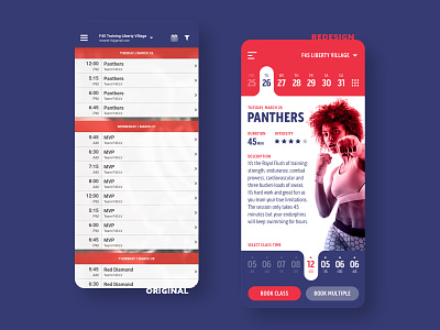
F45's app might be the definition for utilitarian... it does what it needs to do... but it does not inspire. I found the experience of finding a class then booking it a little cumbersome, with all the different screen one has to interact with to get results.
My solution is simple: I removed the extra steps by merging 2 screens into 1. F45 always runs the same workout classes on a specific day, so instead of listing time slots to choose from, I decided to first let the user choose a date that they want to book a workout for, give them all the information about that days workout, then let them choose their preferred class time—minimizing the amount of screens to interact with.
What do you think??
—
Show some love! Press "L".
Follow and stay tuned for Week 3.