Lettering for Wee Party

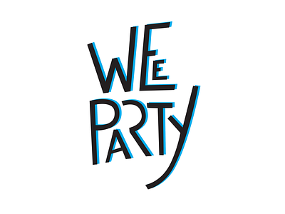

In 2014 I did a lettering concept for a Wee party board game. Personally, I wasn't happy with the result cause the client didn't want even contrasts. But I managed to clear the visual by adding drop shadow layer in cyan color which is one of the colors that I was required to use. So that the letter would have some balance.