Glow Baby app redesign

Hi, this is a redesign work I did for Glow Baby. For the last year, I spent lots time with my family, especially for my 1 year old daughter. When I just became a mother, I tried lots of baby apps to record my girl's daily, and I found Glow Baby. This is a really good app for new mothers. It helped me and my family a lot. But when I use it, I still can find something that I, as an UI/UX designer would change a little bit.
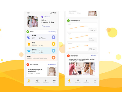
The number one function a parent will use when they open the app is to record their babies daily like sleeping and feeding. The original one you need to swipe down a little bit to use it, it's not very convenient when a mother is breastfeeding or she's in a hurry. So I smaller the size of the baby moments, and moved up the basic functions.
The original View All History is at the bottom of the block, in the redesign I put it in the left top corner so it's easier for parents to check it out.
Also I designed icons for Daily Scoop, Growth Chart and Promotion, cause I think they should be put in the same consistency as the basic functions.
Thanks for watching!
Please leave what you think about this one.