Drunk

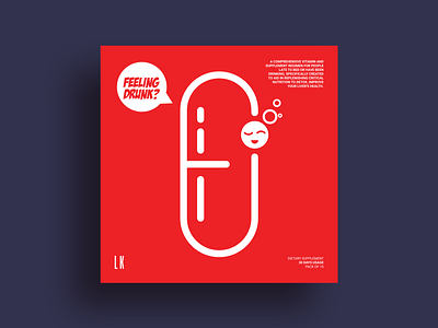
Sharing a new range of package box design called "Drunk" (i.e the same company for which I shared the "tired" range of package box design few days back). Will be sharing the remaining soon. Like "tired" range, keeping the consistency and family theme, the preference was to keep it clean, minimal and relevant with a bit of fun. While designing the same, I preferred to keep their capsule (i.e their supplement) as the main central design element. For their multiple range, I contemplated to create a design where their range can be integrated smoothly with the main capsule design element keeping the design consistency as well as minimal aesthetic appeal. So I created and creatively integrated their multiple range as icons as a part of the capsule itself. Hope you like the same. Thank you. Link to multiple screenshots here - https://bit.ly/2SQI4Hm