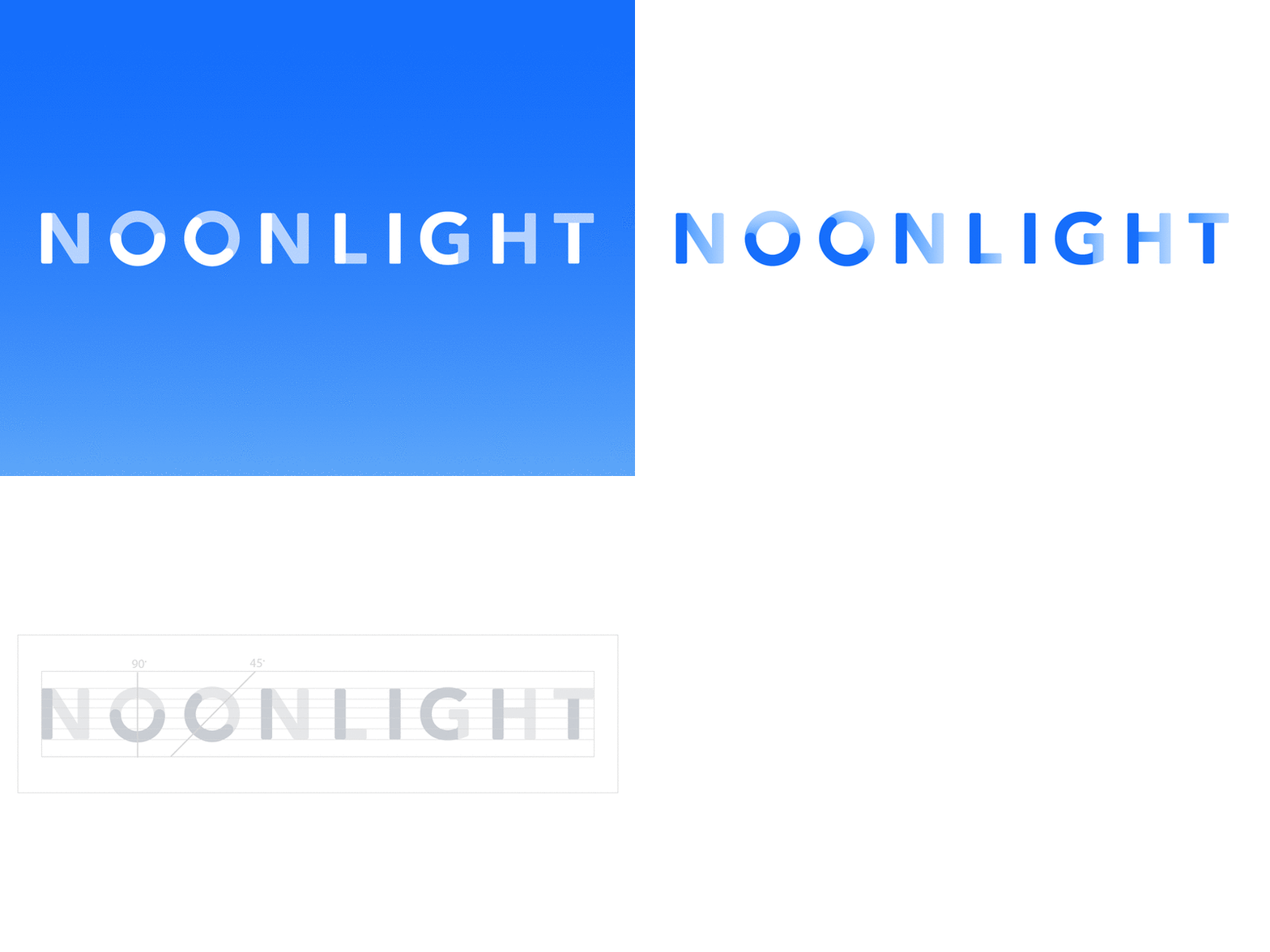
Noonlight Logo
Hello, Dribbblers!
I’m Brittany, Co-founder and CCO of safety startup, @Noonlight. I’m pumped to finally join the community that has inspired me for years. In the coming months, I’ll be sharing some brand, native, web, wearable, and exploratory product work. If you like what you see (many thanks!), we’re looking to add UI, UX, and motion talent to this design team of one 👩🏻💻
A note about my first shot:
The Noonlight typemark is built from a set of contrasting light and dark shapes - meant to represent a shift from the state of being “in the dark” (unsafe) to becoming apparent and visible (clarity and calm). The intent is that even with static forms we experience that moment of transition as things begin to come out of the shadows.
More about all of that to come...
Shoutout to the talented, Kyle Toyama, from PushPlay, and Art Director, Christian McDaniel for their thought partnership and visual identity work.


