


Rochester Americans

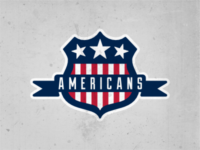
It's been awhile since I've done a sports logo, but I got back into the swing of things today with this Rochester Americans logo. There's a couple things I'm not too sure about, I'll just list them here.
- Does the text work here? Duke's an awesome font but I'm not sure if it is working in this situation.
- How do the stars look crooked? Would they look better straight?
- Does the banner read well?
- Is the white stroke needed?
Thanks for looking guys.