Doreen Garlid for Tempe

When Doreen Garlid approached me to do the branding for her 2020 Tempe City Council campaign, she thought a deep "Republican blue" would be a good idea.
Not so when your election is taking place amidst a presidential primary in March!
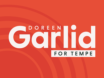
I helped steer Doreen toward something warmer and more locally rooted: "Papago Park" coral, grounded by touches of a dark green and using a lighter palo verde green to break up long print applications. The coral is energetic, forward-looking and unduplicated by any 2020 presidential campaign. An element of concentric circles known as "Suncrop" helps break up the monotony, add texture to backgrounds, and alludes to the sun in Tempe's municipal logo.
The main campaign lockup emphasizes "FOR TEMPE" with its off-center positioning, again serving as an easy cue to potential voters that this is for a local election.