Interaction Exploration

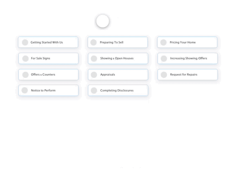
Just an exploration for the interaction animation design. This is actually a redesign but not real project. The original app pages is about learning center for buy and sell home website. It's like tutorial and FAQ's pages for their users.
On the original website, the categories use square rounded cards with icons but looks too plain with old style UI but flat in grey colors. And when users click one of categories, users have to slide the categories (with the same size squares as on the 1st page) to the left and right on the top, so it takes too much time for users to move to another category. So I made it faster by just open the category icon and users can see all categories without scrolling or sliding.