Aroma Discover Improvements


Discover has always been an interesting section for Aroma. Its importance has rivaled search its self. The argument was "what does one search for when one doesn't know what they want?" The answer to this was the discover section.
Through user testing, we found that the discover section felt clunky and to quote a user "a bit of an eyesore" (Ouch...)
We prototyped another version of the discover section and tested it against its predecessor and it didn't do as well as we hoped. Although it looked nicer it still wasn't there. We found the tabs didn't help users, in fact, it created the feeling of "being let down".
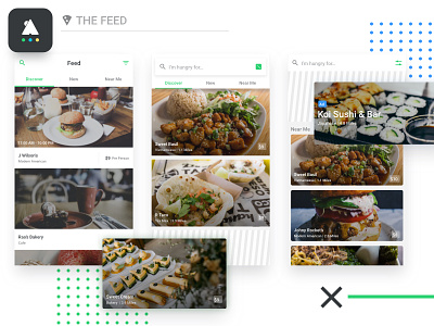
So we prototyped another iteration, one that removed the tabs. (Side note, during this time we were also testing ideas on monetizing the application and found the discover section to be a promising area to add an "ad" or "promoted section") The promoted section was added to the top of the discover section and it would feature different restaurants that paid for a spot or that would be a good fit for the user.
To our surprise, users liked this approach a lot. The simplified section felt clean, gave them a great idea of what was around and created the right expectations. The promoted section held a few concerns that better-budgeted restaurants would hog the section and you would just see them constantly. We ensured them it would be a level playing field and we would rotate the section regardless of the budget.
*My Thoughts*
When I first started user testing I always wanted to validate my assumptions. There was this sense of pride on the line and if I was wrong I was a bad designer. The more I go through the process the more I am just excited to find truth regardless if I am right or not.