Mountain Landing Page

Experimenting with minimal landing pages.
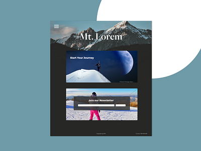
The point of this exercise was to only convey the most essential information and guide the user towards conversion funnels such as buying tickets or signing up for a newsletter.
The user still has control, as there is also a hamburger menu, but that is not the focal point and in a perfect scenario the perfect path is one of the two options above.
Let me know what you think below !