Notefile for Mac icon revised


Taking a break from battling iCloud to clean up this icon a bit. I find it hard to stop incessantly tweaking little details. I finally got to a point where my revisions looked worse, and I had to backtrack a little, so that's usually a good sign that I should stop.
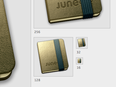
The main change here is that I lowered the contrast on the cover, so that top corner isn't quite so bright, and the bottom is a bit brighter. It's harder to tell in the smaller versions, but I also toned down the texture quite a bit—it's a huge improvement on the large sizes. Then I spent far too long adjusting shadows and sharpening. I also cleaned up the 32px version quite a bit, and created a new 16px version.
For comparison, I've attached a full view of the original and new versions (minus the 1024 size).