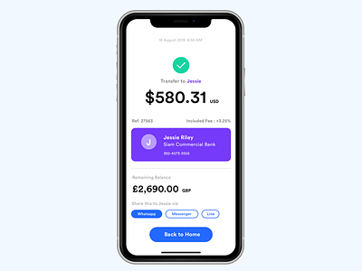
002 Checkout UI Design Challenge
👩🏻💻Today I was busy working with UI wireframe with my client and creating 002 Checkout UI challenge.I just found some good learning. . ✍🏻Normally I would design my wireframe on paper and then I start to create the UI design in prototype tools like Sketch/ Adobe XD or Figma.. . 🤷🏻♀️But the thing is: I spent most of the time choosing the right color not the design systems like button, typography and layout. So I tried to go explore first in Black and white color which helps me refocus which element I should emphasize and watch out for content in UI design. Colors may be not important as much as the content. . 💎Content means when you look at the app, what are goals do you want your user to focus. When it’s in greyscale, it’s easily to spot which part should be organized aesthetically and functionally. Content is always king! 👑

