


Soften Nav Colors

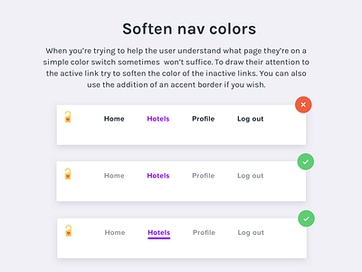


When you’re trying to help the user understand what page they’re on a simple color switch sometimes won’t suffice. To draw their attention to the active link try to soften the color of the inactive links. You can also use the addition of an accent border if you wish.
--------
Hit 'L' if you want to see more design tips
--------
👉 Check out my UI/ UX Masterclass
----
👉 Follow me on Instagram