Simple Moving Average Bar Graph Chart


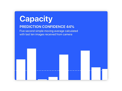
This chart is from a factory processing plant dashboard interface. It displays real-time data and analytics fed from computer vision cameras on the factory floor.
This example shows predictions made by the system on how much capacity a fast moving conveyor belt has given the products moving on it. The system can slow/speed up the conveyor belt based on how many products it detects.
The UI chart / core functionality was adapted from this repo:
https://github.com/borisyankov/react-sparklines