OTOjOY Logo


This is one of the most important logo design of my career. In some ways, I owe a lot to this logo design.
Back when I was starting my design career, almost 8 years ago, I used to participate on 99designs' logo competitions — I was getting a little better at designing logos competition by competition. Then, it all changed when, almost 6 years ago, I participated in the logo design competition held by OTOjOY and won it.
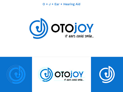
The company works towards helping people with hearing disabilities in US. The logo was a perfect fit for them. The logomark is a combination of four things — O + J + Ear + Hearing Aid In Ear. The whole shape represents an ear and a hearing aid that is wrapped around the back of the ear.
The founder of OTOjOY, Thomas Kaufmann, was very happy with the outcome and instantly hired me to work as their Graphic Designer. Till then, I have worked on hundreds of projects and created thousands of design for OTOjOY and it's still going on.
This logo took my design career to a whole new level and I got to learn everything I know by working on real projects for real people.
What do you guys think of it? I’d love to hear your opinions.
Press F or L to like the shot or leave a comment and make sure to follow me.