


Logo Grid using Golden Ratio for Waves to Wilderness

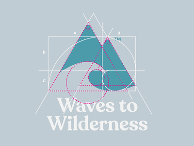
The logo grid of the Waves to Wilderness logo, using the golden ratio and geometric shapes.
The pink shows the construction of the logo using core geometric shapes; two triangles and circles which are in proportion to the Golden Ratio.
The Fibonnaci Swirl, shown in white, shows exactly where the mountains & wave meet (the crosshair part) which is 1.618 of the length of the logomark. The logomark length being measured by the total width of the two triangles (A+B).
You will also notice that these are 'optically aligned' - eg. the tip of the wave goes over the exact point where the crosshair meets, to give better balance to the logo. No geeky grid can can do that. It's done by the naked eye.
"We shouldn’t rely on computers to do all the thinking for us, we should rely on our eyes and our instincts. Designers hone their instincts with every working day, so we should trust them, even when a computer tells us otherwise." - Luke Jones
Full design process case study:
https://justcreative.com/portfolio-item/waves-to-wilderness/