


I.V. Creative Lab Icon

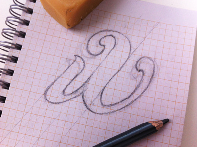
Creating Icon for I.V. Creative Lab. The first concept looked too much like an "a". I focused on separating the "i" from the "V" to solve the issue. I think it's going to work...
Creating Icon for I.V. Creative Lab. The first concept looked too much like an "a". I focused on separating the "i" from the "V" to solve the issue. I think it's going to work...