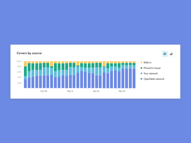
Stacked chart component

OpenTable's Business Intelligence Suite offers a range of analytics for restaurant's to manage and track their performance.
One main chart that restaurants find a lot of value in is understanding where their covers come from - were they made over the phone, online or did they walk-in?
We switch between two views of % and # as both answer different questions. Stacked percentage chart is great for seeing proportional growth in categories, while a traditional stacked chart helps view these categories in context to the overall quantity.