Slack Re-Design Concept

With all of the craze over the new slack logo I've decided to throw my own rendition out there and try to tackle Slack's branding conundrum.
A lot of though, time and love went into the re-brand by Slack and Pentagram and I have a lot of respect for them; this is just my own attempt to try to bridge the gap while retaining the practicality that the Slack team was seeking.
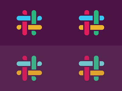
There are two sets of designs I have come up with. The bottom set keeps part of the old color palette intact, though I have modified the background to better contrast with the lesser saturated colors of the logo. The only shape difference between the two logo renditions is the end points. I really appreciated the speech-bubble shape idea the new logo had but I thought the simplicity of the version on the right was pleasing as well, so I kept both options.
Slack and the design team have obviously already gone through all of their options and made their final decision, and in the end, I'm just a 17 year old with a passion for design. I'm glad they were able to find something that worked for them.