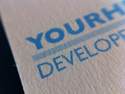
Cards -- Printing Detail
Printing detail from: http://dribbble.com/shots/582744-New-YourHead-Cards
You can see that the line screen for the luxe process is pretty coarse. I stuck to 100% cyan to reduce moireing for the front lettering on the front of the card.
This is an extreme closeup, you can see that the patterning and jaggies are of the same scale as the paper texture -- which appears mostly smooth from reading distance.
View all tags
Posted on
May 30, 2012
More by isaiah View profile
Like

