Reading App Redesign

Towards the end of 2018, I was a bit behind with my reading challenge 😬and somehow stumbled upon Serial Reader and read a couple of short stuff on there.
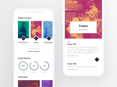
Anyways, I had some fun reimagining the app's looks. Since I quite liked this classical art stuff going on the app I left it as is except changing the colouring to duotone. And to match the texts to the 'book covers' I also opted for some classic serif fonts – plus I rarely get to use them so I had to take the opportunity. 😊
~ not gonna lie I spent most of my time finding the right paintings for the covers 😅~