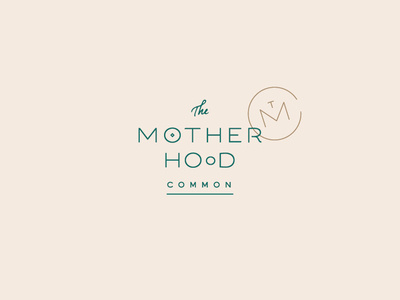
The Motherhood Common Logo

It's really amazing that this super like-minded client not only found me but also that our work together concluded just as my husband and I found out we're expecting. That's right — our first babe is due in April and we couldn't be more thrilled ✨
The Motherhood Common brand is meant to provide support, resources and community for women in every stage of mamahood, from pre-conception to postpartum. My favorite part of this logotype besides the beautiful blend of custom type is the story it tells. The O's provide alludes to the progression of pregnancy from baby in the womb to mother and child side-by-side. It also alludes to the brand's lactation services in a subtle way too.
Meanwhile, the monogram mark represents how the babe is supported by his / her mama (the M), while the mama is supported by her community (the C).
I love when branding can tell a story, especially through type ✨